_edited.png)
Vending Machine Touch Screen: Benefits and Selection Guide

An employee walks into the break room between meetings, taps a familiar product, and gets nothing. The coil turns, the snack stays put, and the machine offers no clear explanation. Someone else tries a card that worked yesterday, while a third person decides it's easier to leave the building and buy refreshments elsewhere.
A vending machine touch screen can remove much of that friction, but only when the technology is selected and operated properly. The screen is just the visible part of a larger system involving product availability, payment recovery, accessibility, hygiene, connectivity, and service. For Oklahoma offices, schools, hospitals, factories, apartments, airports, and public venues, the practical question isn't whether a machine looks modern. It's whether people can use it confidently and whether the operator can keep it working.
The Break Room Experience That Drives Productivity
Every workplace has a vending machine people have learned to avoid. The selection is predictable, the prices are hard to read, and the product window doesn't always match what's inside. A customer may press a button, hear the motor run, and then face the awkward choice of paying again, requesting help, or walking away.
A touchscreen changes that interaction when it displays a clear catalog, current availability, product details, and payment choices in one place. An employee can browse drinks, snacks, frozen items, or healthier alternatives without guessing which selection corresponds to which coil. A well-designed interface can also show promotions, nutritional information, and simple instructions without requiring a printed sign taped to the cabinet.
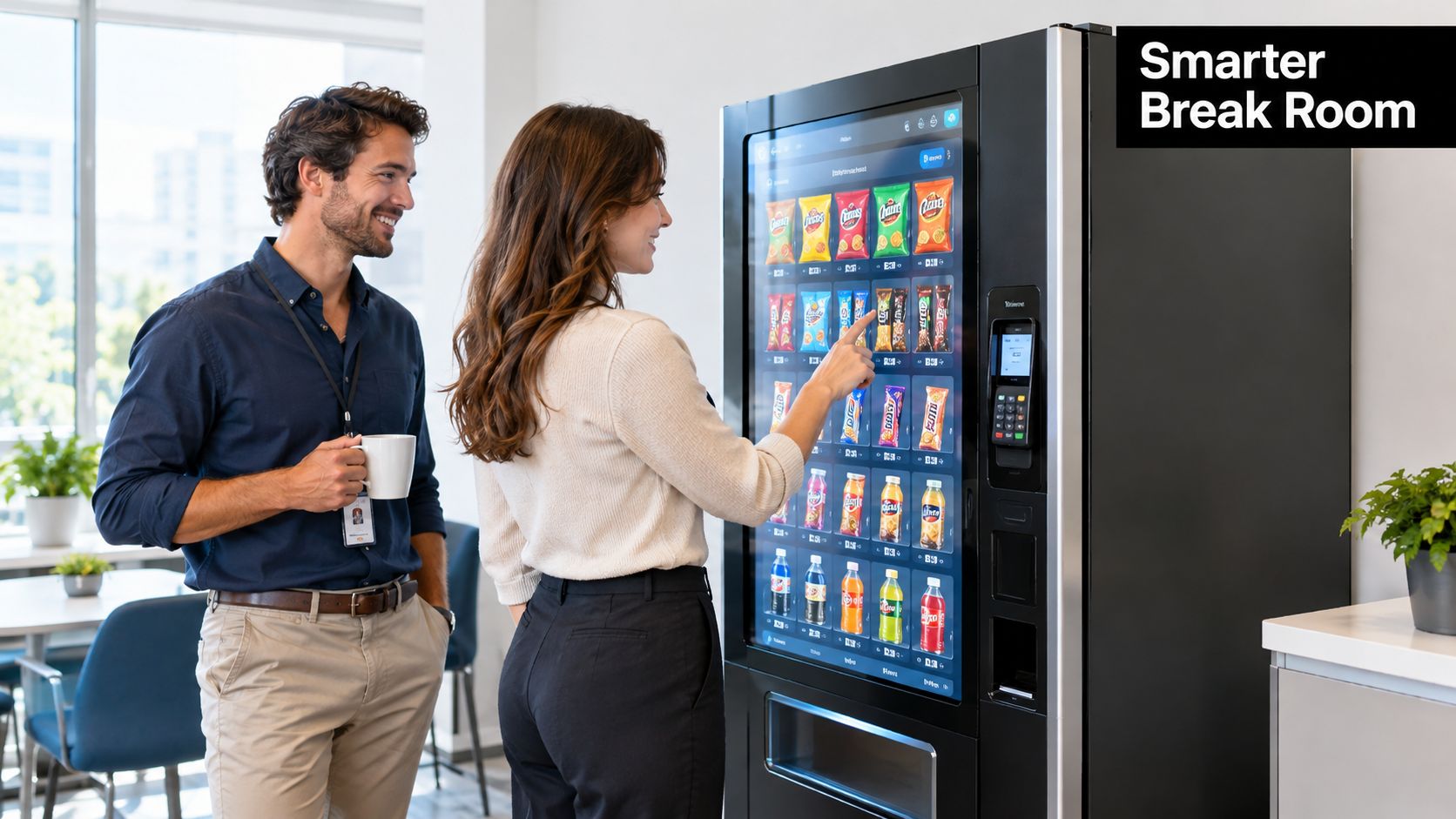
Consider a hospital employee finishing a long shift or a manufacturing worker taking a short break. They don't want to decode a machine. They want to find an item, confirm the price, pay, and receive it. The interface should make those steps obvious, while the operator's service system should make the physical delivery dependable.
Practical rule: A screen improves vending only when it reduces decisions and uncertainty for the customer.
That principle matters in Norman offices as much as it does in Edmond healthcare facilities. A touchscreen can support a stronger break-room experience by making the assortment easier to explore, but product availability still depends on replenishment discipline. If the best-selling drink is missing, an attractive interface won't repair the disappointment.
The machine also depends on a reliable connection for payments, telemetry, and content updates. Businesses planning a connected refreshment area may benefit from wireless network deployment expertise when a machine needs dependable connectivity in a challenging building environment. Network planning should account for the cabinet's location, surrounding construction, and the practical consequences of an outage.
For a closer look at how equipment, assortment, service, and employee expectations fit together, review the break-room experience guide. The strongest vending program treats the break room as a customer-facing workplace amenity, not merely a place where a machine happens to stand.
Hardware Options for Modern Touchscreen Vending
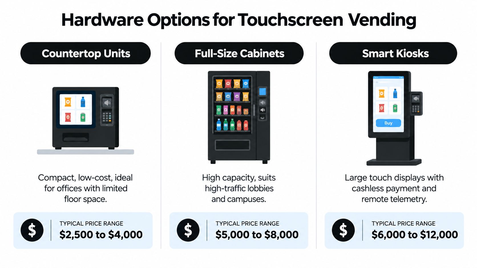
The right touchscreen cabinet starts with the location, not the display size. A compact office with limited floor space needs a different solution from a hospital lobby, college campus, factory entrance, or airport waiting area. Begin by identifying available floor space, expected traffic, product temperature requirements, electrical access, and the level of interaction customers need.
Compact units for constrained spaces
Countertop or compact refreshment units suit offices, clinics, reception areas, and smaller employee break rooms. They can provide a focused assortment without consuming the floor area required by a full cabinet. Their screen should prioritize clear product browsing, payment, and basic promotional content rather than complex animations that slow the transaction.
The trade-off is capacity. A smaller cabinet may need more frequent replenishment if a location has a concentrated demand for a few popular products. Operators should also confirm that the unit supports the desired temperature range and product formats before choosing it for fresh or frozen items.
Full-size cabinets for dependable capacity
A standard bottle-and-can vendor works well where customers expect familiar drinks and packaged snacks. The larger cabinet offers more merchandising flexibility, allowing the operator to separate categories, display more choices, and adjust the product mix as demand changes.
The screen can help customers compare products, but the physical delivery system remains important. A bright interface cannot compensate for poor coil configuration, weak drop detection, or difficult service access. Ask how the cabinet identifies a successful vend and how the software reports an exception.
Dual-zone systems and smart kiosks
Dual-zone chill centers and larger smart kiosks make sense for busy workplaces, campuses, hospitals, and public venues that need a broader assortment. Separate temperature zones can support different product requirements, while a larger touch display can handle categories, promotions, nutritional details, and payment controls.
More hardware also means more components to maintain. Before selecting a premium unit, confirm who handles screen repairs, payment-terminal replacement, refrigeration service, software updates, and parts availability. The smart vending machine selection guide can help buyers compare capabilities without treating every location as though it needs the same cabinet.
A sensible selection process compares space, capacity, temperature, accessibility, payment support, service access, and telemetry, in that order. The most expensive interface isn't automatically the best fit. A simpler machine that stays stocked and responsive will usually serve employees better than a feature-rich cabinet that doesn't match the site.
Software Integration and Telemetry Capabilities
The most valuable part of a touchscreen vending machine may be invisible to the customer. Behind the display, cloud software can connect sales activity, inventory signals, machine health, payment events, and service records. That connection gives an operator a working view of what's happening at each location rather than relying on occasional inspections or customer complaints.
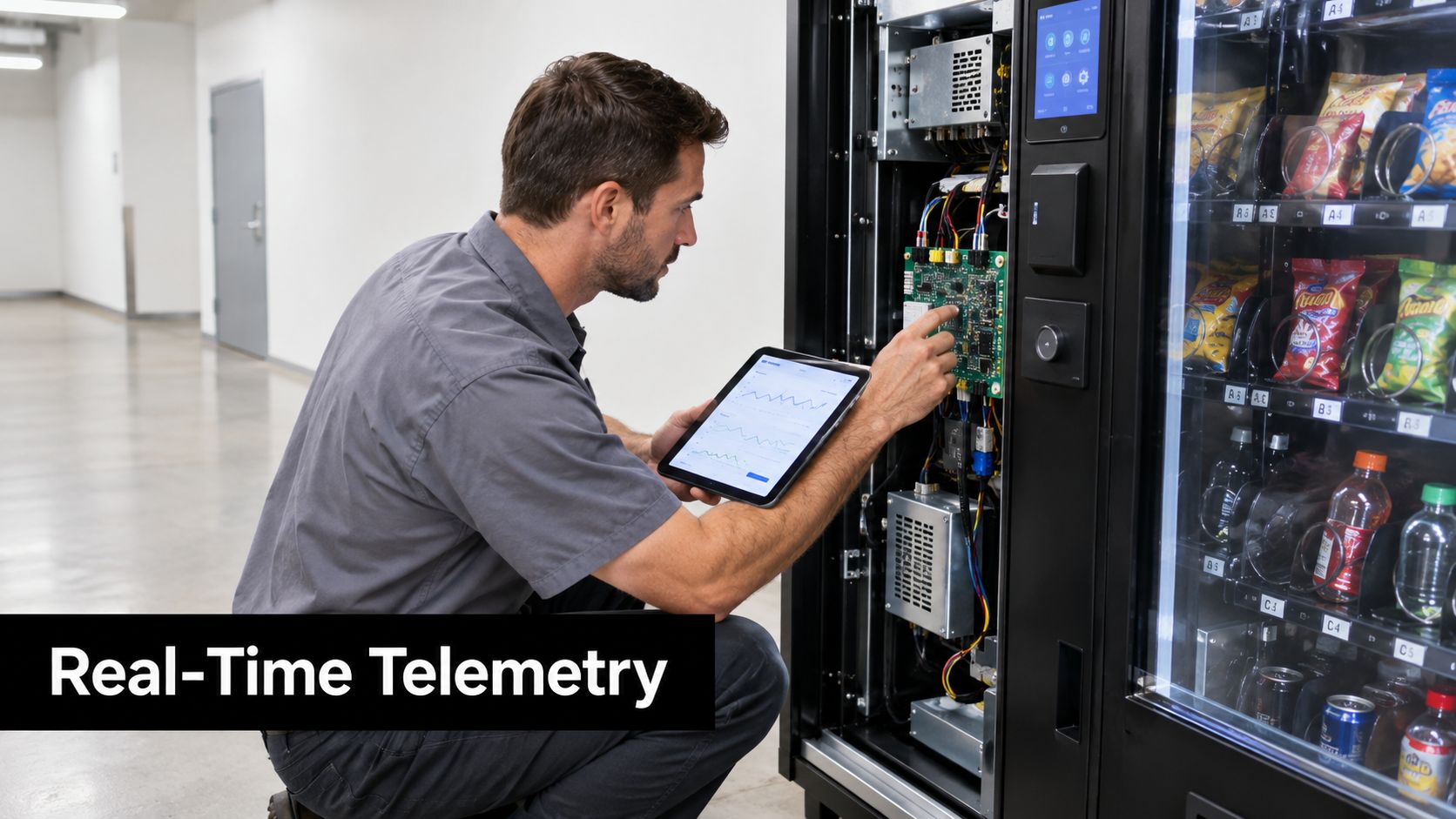
A practical telemetry system can help answer questions such as:
What is selling: Sales patterns reveal whether employees prefer bottled drinks, snacks, frozen meals, or a narrower set of products.
What needs attention: Alerts can identify low inventory, temperature concerns, payment problems, or machine faults.
Where service is needed: Route planning becomes more precise when operators can prioritize machines with actual replenishment or maintenance needs.
Which content performs: Promotions and product messaging can be changed without replacing printed materials.
This data is useful only when someone acts on it. If telemetry reports a low-stock item but the route team doesn't receive a clear task, the software becomes another dashboard that nobody trusts. Operators should ask how alerts are assigned, how exceptions are closed, and whether service history stays attached to the individual machine.
What to ask before signing
A buyer should request a practical demonstration rather than accepting a list of features. Ask the provider to show how a product becomes unavailable on the customer screen, how a failed vend is recorded, and how a service visit is documented. Check whether the system can distinguish a sold product from a selection that never dispensed.
The same applies to assortment decisions. A good operator uses machine-level information alongside employee feedback. Telemetry may show that a product sells slowly, but a facility manager may explain that it serves a small group with specific dietary needs. The best decisions combine recorded behavior with human context.
Read the guide to telemetry data collection for a closer look at how connected vending information supports replenishment and maintenance. The screen attracts attention, but telemetry determines whether the experience remains useful after installation.
A touchscreen also creates a new content responsibility. Product names, prices, images, availability messages, promotions, and instructions all need owners. Establish who approves changes, how quickly inaccurate information is corrected, and what happens when connectivity is unavailable.
For an example of the connected service experience, this demonstration shows how a technician can inspect machine electronics and use a tablet during service.
Accessibility Barriers Most Guides Ignore
A machine can meet a physical height requirement and still exclude customers. A touchscreen without audible output may be unusable for a blind or low-vision customer. Instructions delivered only through sound can leave a deaf or hard-of-hearing customer without an equivalent path, while small controls and fast timeouts can frustrate people with limited dexterity or older users.
The U.S. Access Board identifies these issues in its discussion of accessibility for self-service transaction machines, including the need to consider audible information, captions or text equivalents, seated operation, and privacy. Accessibility therefore involves the complete interaction, not just whether someone in a wheelchair can reach the cabinet.
Design for more than one way to interact
A genuinely inclusive vending flow should offer redundancy. Product names and prices need readable text, strong contrast, and sufficient size. Important status messages should appear visually and be available through speech output where appropriate. A customer should be able to cancel, correct a selection, and understand whether payment succeeded without depending on a single sensory channel.
Older users and people with motor limitations may struggle with gestures such as scrolling or double-tapping. Keep the primary path simple. Use obvious buttons, avoid relying on hidden swipe actions, and give customers enough time to read and act without forcing them to restart.
WCAG 2.2 sets a minimum interactive target of 24 by 24 CSS pixels at Level AA, while its stronger Level AAA target is 44 by 44 CSS pixels. The W3C also references a physical target of approximately 9 by 9 millimeters for mobile touch interfaces. For a vending machine used while standing, carrying items, or operating from a seated position, the larger target is a more practical engineering baseline. See the WCAG 2.2 target-size guidance for the distinction between these requirements.
Test the installed machine
Accessibility testing should happen on the actual cabinet, at its installed angle and height. Automated checks can verify dimensions and contrast, but they can't show whether a customer accidentally activates the neighboring product or misses an important instruction.
Include testers with different ages, vision levels, hearing abilities, motor limitations, and preferred interaction methods. Check these tasks:
Finding a product: Can a customer browse without relying on color alone?
Understanding the transaction: Are selection, price, payment, and dispense states clear?
Recovering from an error: Can the customer cancel or request assistance?
Using a seated position: Are controls visible and reachable?
Completing a nonvisual flow: Does speech output or an alternative control path provide equivalent information?
A simple interface with redundant feedback is often more accessible than a visually elaborate menu. The aim isn't to make the machine look advanced. It's to make the purchase possible for as many customers as practical.
Payment Systems and Privacy Considerations
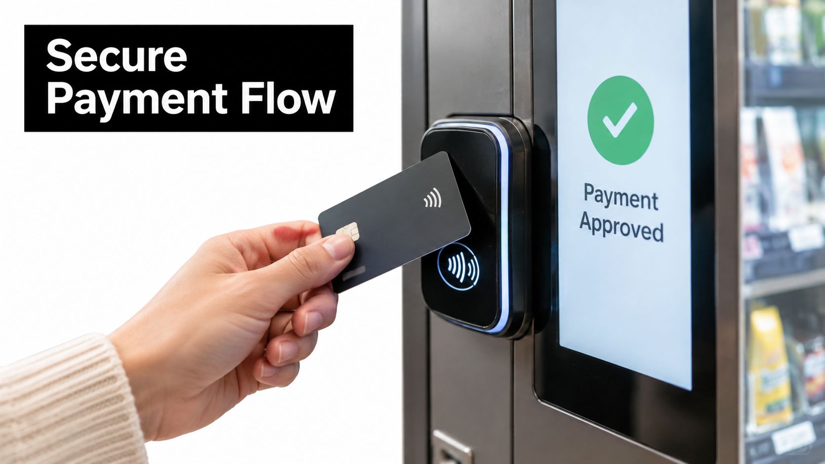
A payment logo on the cabinet tells only part of the story. Customers also need to know what happens if their card is authorized but the product doesn't drop, the network disconnects during checkout, or the machine restarts after payment. A trustworthy vending provider designs the complete transaction, from authorization through dispense confirmation and refund handling.
Contactless and mobile payments represented 77% of cashless vending sales in 2024, and mobile sales grew by more than 300% during that year, reaching 29% of cashless sales, according to the 2025 micropayment trends report from Cantaloupe. Those figures make payment reliability and data handling central operational concerns, not optional extras.
Authorization is not fulfillment
A tokenized contactless payment replaces sensitive card details with a transaction token during processing. That helps reduce the need for the vending system to handle the customer's actual card number, but tokenization doesn't guarantee that the selected product will dispense.
The provider should be able to explain how the machine connects these events:
The customer selects a product.
The payment system authorizes the transaction.
The machine attempts delivery.
The machine confirms a successful vend or records an exception.
The system issues, initiates, or routes a refund when delivery fails.
Ask how long refunds normally take, which support channel customers see on the machine, and whether managers can review failed transactions. A visible phone number or support method is more useful than a generic promise that problems will be handled.
Protect privacy at the interface
Privacy also covers receipts, loyalty programs, mobile checkout, and telemetry. Buyers should ask what customer information is retained, who can access it, how long it remains available, and whether optional marketing features can be disabled. The system should collect only what the service requires.
Site owners should review the screen for accidental exposure. A customer shouldn't have to display personal information to nearby people while completing a purchase. Clear cancellation controls and discreet payment prompts matter in offices, hospitals, schools, and public venues.
For more detail on protecting the payment experience, see the mobile payment security guide. Apple Pay, Google Wallet, contactless cards, QR checkout, and cash can coexist, but every method should have a documented failure and support path.
Hygiene and Public Health Design Strategies
Customers judge a public touchscreen before they touch it. Smudges, unclear cleaning records, and a visibly neglected cabinet can make an otherwise functional vending machine feel unsafe. In a hospital, school, airport, or busy workplace, that perception can reduce completed purchases even when inventory and payment systems work correctly.
A controlled study of 22 participants found that 8 preferred a non-touch interaction method, while 20 said they would use the tested system. The findings support a practical conclusion: people may accept touchscreen vending while still valuing an alternative. Related public-display research also identifies touchscreens as potentially contaminated surfaces and reports that users value knowing when the display was last cleaned. See the study on public touchscreen interaction and hygiene for that evidence.
Make cleaning visible and repeatable
A cleaning program should identify who cleans the screen, which product is approved, when the task occurs, and how completion is recorded. A small visible message showing the latest cleaning time can reassure customers, provided the information is accurate and updated by staff.
Operators should distinguish cleaning from sanitizing rather than treating the terms as interchangeable. The practical difference is explained in cleaning versus sanitizing explained, which can help facility managers align their procedures with the products and surfaces involved.
Antimicrobial-compatible materials may support the design, but a coating isn't a substitute for routine service. It doesn't eliminate contamination between cleaning cycles and may conflict with manufacturer instructions for screen care. Confirm the approved cleaning method before deploying chemicals across a fleet.
Give customers a touchless path
A QR code can open a mobile product catalog or checkout flow. A mobile web option may suit customers who don't want to touch the screen, while proximity-based interaction can reduce physical contact where the hardware supports it. These alternatives also help when the screen is temporarily unavailable.
Telemetry can connect hygiene to normal operations. Service teams can log cleaning visits alongside replenishment, maintenance, and inventory events, giving a location manager a record to review. That turns hygiene from an informal promise into an auditable operating task.
The best approach combines visible status, approved materials, routine cleaning, touchless fallback, and service records. Customers don't need a complicated explanation. They need evidence that the operator thought about the surface they're being asked to use.
Building Visibility Through Local SEO and Reviews
A well-run touchscreen vending program deserves to be discoverable by the businesses that need it. An office manager searching for break-room vending, a school administrator looking for campus refreshment service, or a hospital facilities team seeking a vending operator may never see a provider whose website fails to explain where it works and what it installs.
Google says local listing information can come from publicly available website content, licensed third-party data, user-contributed facts such as reviews and photos, and Google's own interactions with a business. That makes clear, crawlable website content a practical asset. Publish the service area, facility types served, machine categories, payment options, support process, and location-specific information for Oklahoma City, Norman, Edmond, and surrounding communities. Google's guidance on how local listings are sourced explains why consistency matters.
Build pages around real buying situations
A vending operator shouldn't force every visitor onto one generic services page. Create useful pages for workplace vending, office break-room vending, school vending, hospital vending, manufacturing sites, apartments, airports, and stadiums when those services are genuinely available.
Each page should answer the questions a buyer has before contacting an operator:
What equipment fits the site: Explain compact refreshment centers, bottle-and-can vendors, dual-zone chill centers, and frozen food machines.
How service works: Describe replenishment, assortment adjustments, maintenance response, and customer support.
What payments are accepted: State whether the program supports cashless cards, Apple Pay, Google Wallet, or other available methods.
How customer feedback shapes inventory: Explain how preferences and location-level sales information influence product selection.
What happens after installation: Show how telemetry, follow-ups, and service records support the account.
A workplace page can connect on-site refreshments with employee convenience. The Bureau of Labor Statistics American Time Use Survey release reported that 73% of employed people did some or all of their work at their workplace. That supports positioning break-room vending as an on-site amenity for organizations whose employees spend working time at their facilities.
Measure searches, calls, and trust
Google Business Profile performance reporting shows the search terms people used to find a business, along with profile views, calls, website clicks, and product views. Google says the data covers discovery through Search and Maps. Review the report regularly to see whether people are finding the business through phrases related to office vending, employee snacks, hospital vending, or vending service.
Reviews need the same operational discipline as machines. Ask real customers for feedback, respond professionally, and address service issues rather than hiding them. Google's review-snippet guidance says ratings must come directly from users, and businesses can't make their own pages eligible for review stars by creating, controlling, curating, or compiling the displayed reviews. Practical discussion of review signals in local search can add context, but the core rule is simple: publish genuine customer feedback and keep promotional claims separate from rating data.
Use structured data only when it accurately represents the business and its reviews. Don't add unsupported aggregate scores, self-written testimonials, or markup that describes feedback Google can't verify.
Finally, document the operating practices that support the marketing promise. The industry best-practices guide can help operators connect equipment selection, service consistency, accessibility, payment recovery, hygiene, reviews, and local content into one business process. Search visibility grows more credibly when the website reflects what customers actually experience.
Vendmoore Enterprises provides managed smart vending services and machine ownership options for Oklahoma workplaces and public spaces, with touchscreen browsing, cashless payments, telemetry, customized assortments, and responsive replenishment. Visit Vendmoore Enterprises to discuss a break-room vending program designed around your facility, customers, and day-to-day service requirements.
Comments